
BFREE
기능을 담은 엣지 컨셉으로 BFREE 제품군의 디자인 아이덴티티를 구축하다.
Building the design identity of the BFREE product lineup through a functional edge concept.
Client
Category
Year
Role
동양이엔피 (Dongyang e&p)
모바일 충전기 & 어댑터 액세서리
(Mobile Charger & Adapter Accessories)
2021
디자인 기획 (Design strategy)
제품 디자인 (Product design)

SUMMARY
BFREE는 동양이엔피의 무선 충전기, 패드형 충전기, 전원 어댑터로 구성된 충전기 제품군 전반을 하나의 디자인 언어로 통합한 프로젝트입니다.
STORYFORM은 제품군 전체를 관통하는 디자인 원칙으로 Functional Edge System을 정의하고, 엣지가 곧 기능이 되고, 형태가 곧 사용성이 되는 설계 방식을 적용했습니다.
BFREE는 단일 제품 디자인을 넘어, 충전 환경 전반의 사용 경험을 하나의 시스템으로 정리한 결과물입니다.
BFREE is a product line design project that unifies Dongyang E&P’s wireless chargers, charging pads, and power adapters under a single design language.
STORYFORM defined a core design principle called the Functional Edge System, where edges are not merely visual elements, but functional structures that enhance usability and interaction.
BFREE goes beyond individual products to establish a coherent charging ecosystem built on a shared design system.
KEY DESICIONS
1) 기능을 담은 엣지 디자인
BFREE의 모든 제품은 공통된 엣지 구조를 기반으로 디자인되었습니다.
이 엣지는 시각적 통일성을 형성하는 동시에 사용자가 제품을 집고, 올리고, 빼는 모든 동작에 직접적으로 관여하는 기능 구조입니다.
Functional Edge System은 형태, 사용성, 브랜드 정체성을 하나의 조형 언어로 통합하는 설계 방식입니다.
1) Functional Edge System
All BFREE products are built around a shared edge structure.
This edge is not only a visual signature, but a functional interface that supports every physical interaction — holding, placing, and removing the device.
The Functional Edge System unifies form, usability, and brand identity into a single design language.


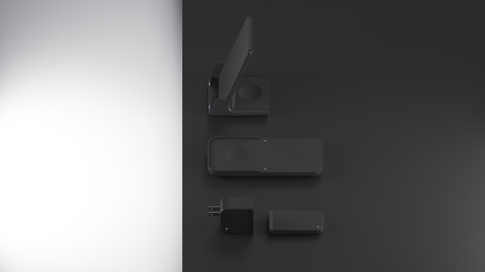
2) 무선 충전기 제품군의 직관적 거치 구조
스탠드형 무선 충전기는 Functional Edge 구조를 통해 스마트폰을 세로, 가로 방향 모두 안정적으로 거치할 수 있도록 디자인되었습니다.
패드형 충전기에서는 엣지의 높낮이 변화를 활용해 스마트폰과 스마트워치 충전 영역을 직관적으로 구분했습니다.
이를 통해 별도의 안내 없이도 각 충전 존을 자연스럽게 인지할 수 있습니다.
2) Intuitive docking structure for the wireless charger lineup
The stand-type wireless charger is designed with a Functional Edge structure that securely supports both vertical and horizontal smartphone placement.
On the charging pad, variations in edge height are used to intuitively separate the smartphone and smartwatch charging zones.
This allows users to naturally recognize each charging area without the need for additional guidance.


3) 어댑터의 조작성을 높이는 엣지 구조
어댑터 후면의 돌출 엣지는 콘센트 삽입과 분리 시 손가락이 자연스럽게 걸리는 구조로 설계되었습니다.
작은 동작에서도 사용 편의성이 느껴지도록 디테일을 완성했습니다.
2) Edge design for improved handling of the adapter
The raised rear edge of the adapter provides a natural grip point for plugging and unplugging, enhancing usability through subtle but meaningful form articulation.


OUTCOME & IMPACT
BFREE는 충전기 제품군 전반에 걸쳐 일관된 사용 경험과 브랜드 인식을 구축했습니다.
Functional Edge System을 통해 각기 다른 제품이 하나의 디자인 체계로 연결되며, 사용자는 어떤 제품을 사용하더라도 동일한 조작 감각과 경험을 느낄 수 있습니다.
BFREE establishes a consistent user experience and brand identity across the entire charger lineup.
Through the Functional Edge System, individual products are connected into a unified ecosystem, allowing users to experience the same intuitive interaction across every device.
bfree
기능을 담은 엣지 컨셉으로 BFREE 제품군의 디자인 아이덴티티를 구축하다.
Building the design identity of the BFREE product lineup through a functional edge concept.
Client
Category
Year
Role
동양이엔피 (Dongyang e&p)
모바일 충전기 & 어댑터 액세서리
(Mobile Charger & Adapter Accessories)
2021
디자인 기획 (Design strategy)
제품 디자인 (Product design)
SUMMARY
BFREE는 동양이엔피의 무선 충전기, 패드형 충전기, 전원 어댑터로 구성된 충전기 제품군 전반을 하나의 디자인 언어로 통합한 프로젝트입니다.
STORYFORM은 제품군 전체를 관통하는 디자인 원칙으로 Functional Edge System을 정의하고, 엣지가 곧 기능이 되고, 형태가 곧 사용성이 되는 설계 방식을 적용했습니다.
BFREE는 단일 제품 디자인을 넘어, 충전 환경 전반의 사용 경험을 하나의 시스템으로 정리한 결과물입니다.
BFREE is a product line design project that unifies Dongyang E&P’s wireless chargers, charging pads, and power adapters under a single design language.
STORYFORM defined a core design principle called the Functional Edge System, where edges are not merely visual elements, but functional structures that enhance usability and interaction.
BFREE goes beyond individual products to establish a coherent charging ecosystem built on a shared design system.
KEY DECISIONS
1) 기능을 담은 엣지 디자인
BFREE의 모든 제품은 공통된 엣지 구조를 기반으로 디자인되었습니다.
이 엣지는 시각적 통일성을 형성하는 동시에 사용자가 제품을 집고, 올리고, 빼는 모든 동작에 직접적으로 관여하는 기능 구조입니다.
Functional Edge System은 형태, 사용성, 브랜드 정체성을 하나의 조형 언어로 통합하는 설계 방식입니다.
1) Functional Edge System
All BFREE products are built around a shared edge structure.
This edge is not only a visual signature, but a functional interface that supports every physical interaction — holding, placing, and removing the device.
The Functional Edge System unifies form, usability, and brand identity into a single design language.
2) 무선 충전기 제품군의 직관적 거치 구조
스탠드형 무선 충전기는 Functional Edge 구조를 통해 스마트폰을 세로, 가로 방향 모두 안정적으로 거치할 수 있도록 디자인되었습니다.
패드형 충전기에서는 엣지의 높낮이 변화를 활용해 스마트폰과 스마트워치 충전 영역을 직관적으로 구분했습니다.
이를 통해 별도의 안내 없이도 각 충전 존을 자연스럽게 인지할 수 있습니다.
2) Intuitive docking structure for the wireless charger lineup
The stand-type wireless charger is designed with a Functional Edge structure that securely supports both vertical and horizontal smartphone placement.
On the charging pad, variations in edge height are used to intuitively separate the smartphone and smartwatch charging zones.
This allows users to naturally recognize each charging area without the need for additional guidance.
3) 어댑터의 조작성을 높이는 엣지 구조
어댑터 후면의 돌출 엣지는 콘센트 삽입과 분리 시 손가락이 자연스럽게 걸리는 구조로 설계되었습니다.
작은 동작에서도 사용 편의성이 느껴지도록 디테일을 완성했습니다.
2) Edge design for improved handling of the adapter
The raised rear edge of the adapter provides a natural grip point for plugging and unplugging, enhancing usability through subtle but meaningful form articulation.
OUTCOME & IMPACT
BFREE는 충전기 제품군 전반에 걸쳐 일관된 사용 경험과 브랜드 인식을 구축했습니다.
Functional Edge System을 통해 각기 다른 제품이 하나의 디자인 체계로 연결되며, 사용자는 어떤 제품을 사용하더라도 동일한 조작 감각과 경험을 느낄 수 있습니다.
BFREE establishes a consistent user experience and brand identity across the entire charger lineup.
Through the Functional Edge System, individual products are connected into a unified ecosystem, allowing users to experience the same intuitive interaction across every device.
 informationprojectscontact